As part of the short film task that I am undertaking, it is crucial for me to also develop the marketing of the film. The predominant reason for this being that in modern day society the marketing of a product is just as important as the actual medium itself.
I have been given the brief of making:
a poster for the film
a film magazine review page featuring the film
In order to effectively identify the key codes and conventions of both briefs I have researched both tasks in order to get the most realistic marketing briefs for my film.
I began through looking at posters for short films, one short film I looked at was
Krotki film o milosci:
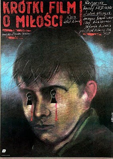 Analysis
Through looking at the image, it is apparent that the boy is in the centre of the frame. Thus, making the character more significant to the narrative of the film. The cover is rustic looking and the boy appears to have been drawn on the cover rather than taken from a photograph. Therefore, emphasising the theme of the plot to which social class becomes reinforced throughout parts of the narrative. Upon identifying what this film was about it was apparent to me that it linked in ideas of love and hatred. Therefore, the use of the two key holes covering the boy's eyes shows that he is being exposed to things in the narrative that he does not wish to be exposed to. The significance of the red tears is a symbol feature for the idea of blood. Therefore, meaning that consumers of the film are made to feel sorry for the boy on the cover as the symbols on the cover identify that he is being hurt. not neccesarily physically but internally through his emotions. Therefore, the key symbols and the tears of blood are used as a shock factor to emphasise the tragic pace of emotions that the boy is experiencing, however unable to show without physical representations. The use of the bold red title makes the genre of the short film more horrific, even more so reinforced with the white titled description to the right of it. Thus, emphasising that the short film is coming from the boy's perspective as he is affected by others and finds it hard to express this.
As well as this I also looked at the short film
"Sick":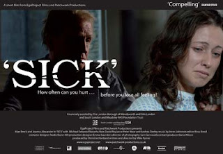
"New short film, 'SICK', dealing with the sensitive subject of depression, has linked up with Samaritans. Through seeing the film it is hoped that people will come forward to the charity earlier for help and support".
AnalysisThe significance of two characters on the cover shows that they have a relationship together. After researching the film it is apparent that "The 15 minute film depicts the experience of depression and alcoholism which have left Brian’s daughter, Amanda, relying on him for her son’s welfare". The lighting within the image highlights the dark nature of the narrative, that being depression. The fact that the father's image is darker emphasises that he maybe the cause of his daughter's anxiety. Her lighting is much brighter, thus emphasising that her condition is brough to life throughout the narrative. Consequently, making the plot more centralised around her. The use of the black cover acts as a symbol for the darkness of the narrative. The white font is distinctive on the cover because it detracts from the predominant darkness of the cover. The use of the words "How often can you hurt... before you lose all feeling?" is used as a shock tactic for the consumer. Consequently, meaning that the only way that consumers can find out the ill feeling in the narrative is through actually watching it. Moreover, the facial expressions of both characters highlight the darkness of the narrative as neither character is smiling. This darkness is only emphasised even more so, upon the use of the hospital like outfit that the female character is presented with. Thus, emphasising the severity of her condition with the use of the facial expressions it helps to reinforce this.
Lastly I looked at the film
"The Storm":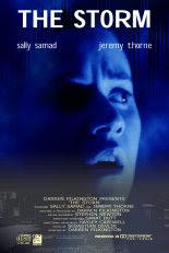
General Plot:"During one of the worst thunderstorms in recent memory, workaholic businesswoman Sarah is left with no electricity and no one to keep her company. The only person able to help her out is her flat mate from downstairs, the loner Dennis".
"During the night, she slowly begins to loose her sanity as strange events happen around her. But is everything real, or is the stress of her job finally taking its toll and making her imagination run riot? The police are unable to help her. And what of her only real friend downstairs? Can he help?"
More information on http://www.walrusfilms.co.uk/the-storm.html AnalysisThe emphasis of the poster is centralised around the facial expressions of the female character on the cover. The significance of the raised eyebrows within the image emphasises the curiosity within the narrative. Thus, meaning that there is a certain level of ambiguity within the plot in order to keep the audience members engaged with what is happening. The background choice of blue emphasises that the genre of the short film is less horrific -unlike "Sick"- and more adventurous and exhilirating. The fact that the female character has her mouth open shows she is in shock of an event that has occured within the narrative. This emphasises her innocence as strange events happen throughout the night that make her question whether "the stress of her job finally taking its toll and making her imagination run riot? The police are unable to help her. And what of her only real friend downstairs? Can he help?". The title is on the top of the poster and the actors names beneath it, with the additional titles at the bottom of the poster. Thus, making the poster more formal as everything appears more organised unlike the previous two posters in which I have looked at. The character is made more centralised and the consumers are made to question more as to what the narrative is about and how it will end. The lighting has been used to create a significant effect, half of the females face is dark and the other half is light. Thus, emphasising the two sides of her life that she currently obtains, that being one of the stressful working light where she has high demands and expectations and the other where she is at home and is made to feel inferior of her social/ personal life.
Consequently, making the poster an effective piece of marketing as it intrigues consumers into the film and its simplicity makes it all the more interesting to watch for the first time.


